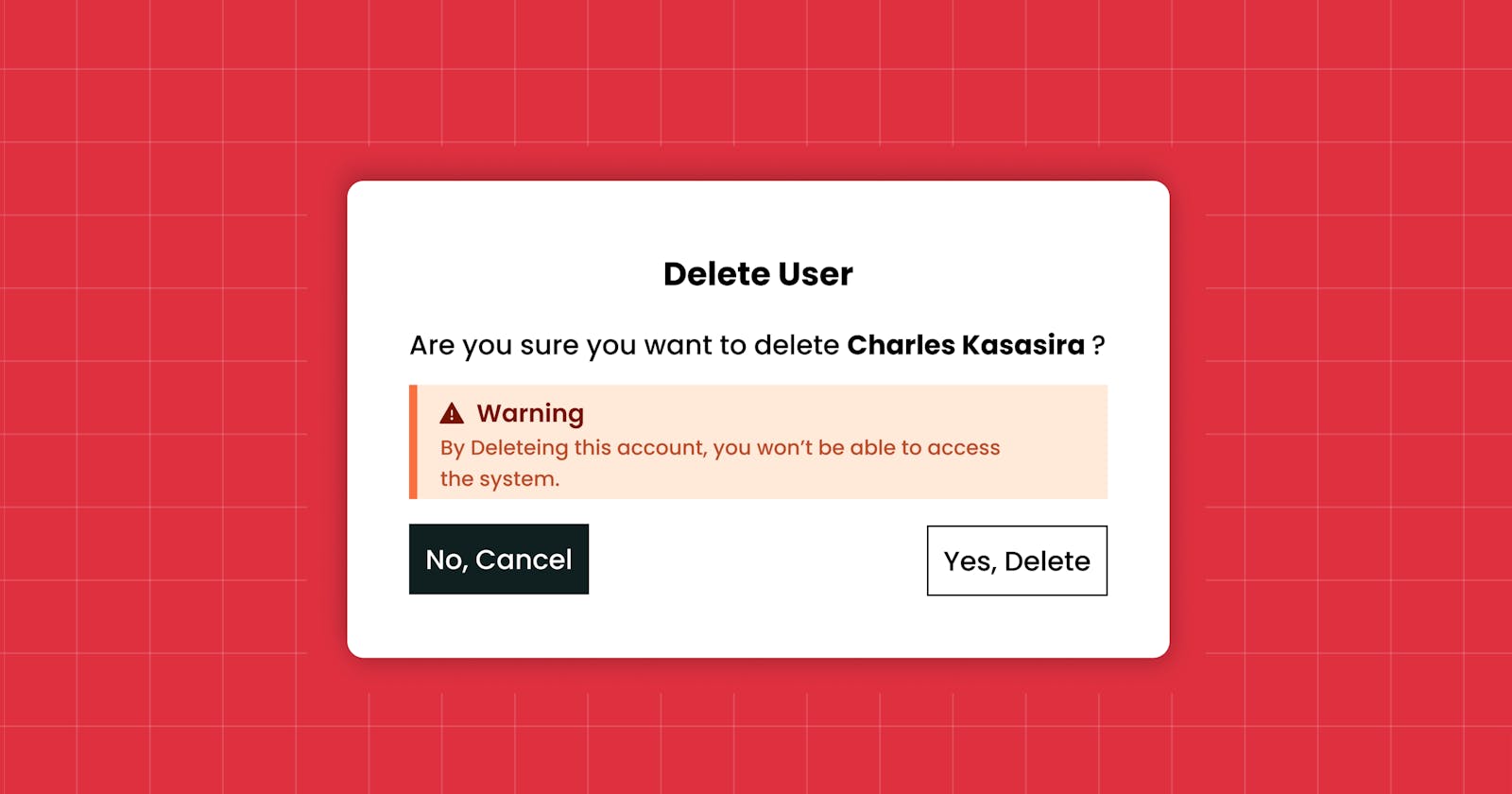
What we will build
Hello Hope all is well, in this article I share on how to create a simple popup or modal component in reactjs using the useState hook. for the styles I will be using tailwindcss.
Your can checkout the video version for more details.
Create React App
First we will create our app with create-react-app, that's assuming you already have nodejs installed.
npx create-react-app react-modal
Adding Tailwindcss to a react js project
To install tailwindcss in reactjs is very easy. you will only need this few commands first make sure you are in the project folder that is you should be able to see the node modules folder and other folders plus files. then just copy and paste these commands
npm install -D tailwindcss postcss autoprefixer
npx tailwindcss init -p
Then update the tailwind.config.js file, this should be in the root of your project, that is next the package.json file.
/** @type {import('tailwindcss').Config} */
module.exports = {
  content: [
    "./src/**/*.{js,jsx,ts,tsx}",
  ],
  theme: {
    extend: {},
  },
  plugins: [],
}
Then next, add these Add the Tailwind directives to your index.css file.
@tailwind base;
@tailwind components;
@tailwind utilities;
Tailwindcss is configured
Installing React-icons
npm install react-icons
This package will help us use the different icons, for this component, we shall use one in particular, the (IoWarning) icon, you can checkout React-icons for all the available icons.
Creating Modal using useState Hook
In the App.js file, we setup the button which will trigger our model.
import { useState } from 'react'
import Modal from './Modal'

function App() {
  const [popUp, setPopUp] = useState(false)

  return (
    <div className='p-20'>
      <div className='flex gap-8 items-center mb-10'>
        <div className='bg-gray-700 text-white w-16 h-16 rounded-full flex items-center justify-center'>
          CK
        </div>
        <div className='flex flex-col justify-center'>
          <h1 className='font-bold text-3xl'>Charles Kasasira</h1>
          <p className='text-gray-700'>Web developer</p>
        </div>
      </div>
      <button className='outline outline-1 px-3 py-2 hover:bg-black hover:text-white'
      onClick={() => setPopUp(true)}
      >Open Modal</button>
      {popUp && <Modal setPopUp={setPopUp} />}
    </div>
  );
}

export default App;
Modal Component This is our model component, you can watch more of the explanation on my youtube channel youtube.com/charleskasasira
import React from 'react'
import { IoWarning} from 'react-icons/io5'

function Modal({setPopUp}) {
  return (
    <div className='w-screen h-screen bg-black bg-opacity-30 fixed top-0 right-0 flex justify-center items-center'>
      <div className='bg-white p-10 rounded-md shadow-md'>
        <h1 className='font-bold text-center text-lg my-5'>Delete User</h1>
        <p>
          Are you sure you want to delete <b>Charle Kasasira</b>
          <p className='bg-[#ffe9d9] p-2 border-l-2 border-[#fa703f] text-[#bc4c2e] flex flex-col text-sm my-1'>
            <span className='text-[#771505] font-bold flex items-center gap-1'>
              <IoWarning />
              Warning
            </span>
            By Deleting this account, you won't be able to access the system.
          </p>
        </p>
        <div className='flex justify-between mt-5'>
          <button className='outline outline-1 outline-[#101f20] bg-[#101f20] text-white py-2 px-4 hover:bg-transparent hover:text-black'
          onClick={() => setPopUp(false)}
          >No, Cancel</button>
          <button className='outline outline-1 outline-[#101f20] hover:bg-[#101f20] hover:text-white py-2 px-4 bg-transparent text-black'
          onClick={() => console.log("Please like and subscribe")}
          >Yes, Delete</button>
        </div>
      </div>
    </div>
  )
}

export default Modal
And that's it. hope this was helpful.
